
![]()
A little more than a year ago, we made Google Trends data available in real time; and increasingly, it’s helping people around the world explore the global reaction to major events.
The vast amount of searches — trillions take place every year — make Google Trends one of the world’s largest real time datasets. Examining what people search for provides a unique perspective on what they are currently interested in and curious about.
So when a big news story happens, how can you best interpret this data?
What is Trends data?
Trends data is an unbiased sample of our Google search data. It’s anonymized (no one is personally identified), categorized (determining the topic for a search query) and aggregated (grouped together). This allows us to measure interest in a particular topic across search, from around the globe, right down to city-level geography.
You can do it, too — the free data explorer on Google Trends allows you to search for a particular topic on Google or a specific set of search terms. Use the tool and you can see search interest in a topic or search term over time, where it’s most-searched, or what else people search for in connection with it.
There are two ways to filter the Trends data: real time and non-real time. Real time is a random sample of searches from the last seven days, while non-real time is another random sample of the full Google dataset that can go back anywhere from 2004 to ~36 hours ago. The charts will show you either one or the other, but not both together, because these are two separate random samples. We take a sample of the trillions of Google searches, because it would otherwise be too large to process quickly. By sampling our data, we can look at a dataset representative of all Google searches, while finding insights that can be processed within minutes of an event happening in the real world.
It’s a unique and powerful dataset, which can complement others, like demographic data from the census, as shown here in the Washington Post. As a sample, it gives us a way to analyse what people are searching for in real time as events unfold. But combining data can be tricky — for instance, it doesn’t make sense to compare Google Trends to other Google datasets, which are measured in different ways. For example, AdWords is meant for insights into monthly and average search volumes, specifically for advertisers, while Google Trends is designed to dig further into more granular data in real time.
What do the numbers mean?
Google Trends is a powerful tool for storytelling because it can allow us to explore the magnitude of different moments and how people react to those moments. We can look back and compare different terms against each other, like how different sports have ranked since 2004. We also can take the total searches for an event to help understand its sheer magnitude. When we released our 2015 Year in Search, we found there were astoundingly over 439 million searches on Google when Adele came back with ‘Hello’.
What’s most useful for storytelling is our normalized Trends data. This means that when we look at search interest over time for a topic, we’re looking at that interest as a proportion of all searches on all topics on Google at that time and location. When we look at regional search interest for a topic, we’re looking at the search interest for that topic in a given region as a proportion of all searches on all topics on Google in that same place and time.
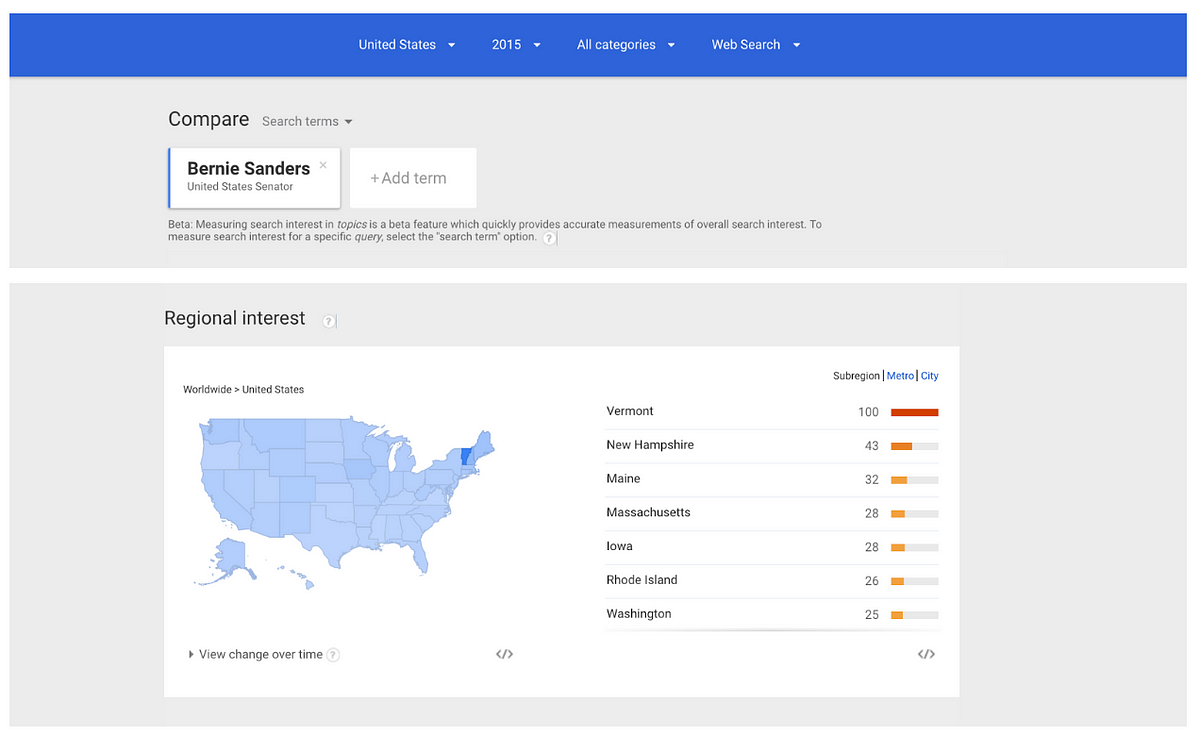
For instance, if we look at the Trends around Bernie Sanders, we can see that Vermont has the highest search interest in the current senator. This is because of all states, Vermont has the highest percentage of searches for Sanders out of all searches in that state. If we had looked at raw data rather than normalized values, we would’ve seen larger states with higher populations rise to the top of the ranks.
That normalization is really important: the number of people searching on Google changes constantly — in 2004 search volume was much smaller than it is today, so raw search numbers wouldn’t give you any way to compare searches then and now. By normalizing our data, we can make deeper insights: comparing different dates, different countries or different cities.
The context of our numbers also matters. We index our data to 100, where 100 is the maximum search interest for the time and location selected. That means that if we look at search interest in the 2016 elections since the start of 2012, we’ll see that March 2016 had the highest search interest, with a value of 100.
If we look at search interest in only March 2016, though, we can see that March 16 has the highest search interest, because we’ve re-indexed our values for just that month.
How do you put the numbers in context?
Because Google Trends data is presented as an index, we often get the question: “how important is this?”
There are a few ways to assess this. The first is understanding relative search interest in the topic compared to itself — or what we would call a “spike”.
As the results came in for the recent EU referendum, Google Trends showed what people were inherently curious about. Search interest in the BBC’s David Dimbleby’s tie spiked, and people searching for “getting an Irish passport” also surged by 100%. Understanding the percent increase in a search topic can be a useful way to understand how much rise in interest there is in a topic. This percent increase is based on a topic’s growth in search interest over a distinct period of time compared to the previous period.
Those “spikes” are a sudden acceleration of search interest in a topic, compared to usual search volume. We know these are interesting because they are often reflective of what’s going on in the real world — there has been a rise in applications for Irish passports in the UK since the vote, for instance.
To get a sense of relative size, we can add additional terms, which helps put that search interest into perspective. For instance, after the Cleveland Cavaliers won the NBA Championships this year, we saw the Cavaliers spike past Taylor Swift, a topic that has consistently high search volume on Google. This helps put into context how large the volume around the “Cavaliers” search query was when it spiked.
We’ve seen lots of reporters use this approach. In the aftermath of the Oregon shooting, Huffington Post saw that search interest in gun control spiked above search interest in gun shop. By looking at this data in the year leading up to the tragedy, they found that this was a pattern for other recent shootings in America.
Huffington Post
Looking at related searches can also help to understand conditions that might be driving spikes in Google Trends. During its annual Person of the Year special, TIME looked back at search interest around each of the candidates. To understand the context around each spike, TIME highlighted the related searches to each topic when it spiked in search to gain a better sense of what drove people’s curiosity at that moment in time.
Time
Trends data can provide a powerful lens into what Google users are curious about and how people around the world react to important events. We’re committed to making Trends easier to use, understand and share. We look forward to continuing the conversation.
I am Data Editor at Google’s News Lab. To get the most recent updates from the team, follow our new Medium publication here.