

Illustration: Jason Torchinsky
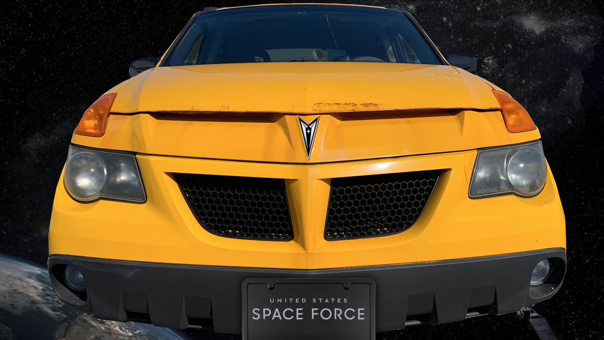
When the Space Force, which is essentially a re-name and re-organization of the Air Force Space Command, first unveiled their emblem early this year, everyone pointed out that it looked a hell of a lot like the emblem of the fictional Starfleet Command from Star Trek. Perhaps as a result of this, Space Force just unveiled a new logo, and, yes, it doesn’t look as Star Trekky. Now it looks like an upside-down Pontiac badge.
In case you, bafflingly, somehow forgot what the Space Force and Starfleet insignias look like, here you go:
Graphic: Paramount, US Air Force
Now, I can’t say I was the first to realize the new Space Force logo would look at home on the grille of a Vega; that credit belongs to Gary Gastelu, who tweeted this:
Gary also mentioned Pontiac’s affinity for colossal bird decals and Star Trek’s affinity for huge bird decals on certain (Romulan) spacecraft, and speculated how great Space Force rockets will look with them.
Graphic: Jason Torchinsky
I’ll admit, I’m not so sure, as the proportions of a rocket kind of limit you to dive-bombing albatrosses, sorta, based on some quick playing with silhouettes. Maybe they could try snakes.
Illustration: Pontiac
The resemblance between the Space Force logo (inverted) and Pontiac’s badge is pretty remarkable, though, down to the little inset star. Some of the bevelings is different, of course, and Space Force has justifications for every bevel and star and whatever:
Graphic: US Space Force
See? Everything you wanted to know about the logo of what’s protecting you from enemies in the “space domain.” I do like the typography used for the SPACE FORCE wordmark, by the way.
Wave to Polaris, everyone.